[Q8 Smiles]
Blurringthebordersofaloyaltyplatform
- [Client]
- Q8
- [Year]
- 2019
- [Disciplines]
- Strategy, UX, Interface Design, Branding
- [With]
- Prophets (now IO)
[The brief]
Q8 wanted a loyalty programme of its own, and it wanted it to feel like part of filling up rather than a card you forget in the glovebox. I joined the very first phase as a UX consultant with Prophets, in a team of four or five, when nothing existed yet but the idea: a smile for every purchase at the pump or in the shop, saved up and spent again. My work was the interface, and the question underneath it: how do you make a loyalty platform disappear into the act of refuelling?
[01]
A blank tank
There was no product to improve, only intent. Q8, one of the big names in fuel in Belgium and across Europe, had decided to build its own loyalty programme. Customers would link what they bought at the pump or in the shop to an account with a code or a card, collect smiles, and spend them later on something like a discount on a sandwich. What that experience looked like, how people would move through it, which features it needed: all of it was still open when we started.
[02]
The smaller the seam, the better
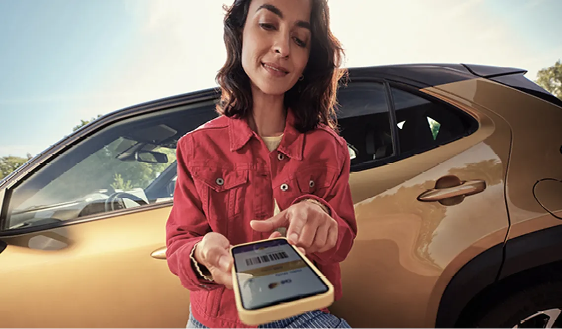
Say the words loyalty platform and people flinch a little. Another app, another card, another thing to remember. We did not want Smiles to feel like a separate tool bolted onto the fuel stop. It had to live inside the wider Q8 app, next to the digital fuel card, the refuelling history and the route to a specific pump, as a natural part of an experience people were already in. The real design problem was the seam between two worlds: what physically happens at the pump or the counter, and what happens on the phone.
[03]
A reflex, not a chore
Loyalty only works once it becomes a habit. You want someone to reach for their phone or scan a code at every single fill-up, without thinking about it, until it is simply part of how they refuel. That set the bar for every screen: simple enough to do with one hand at a pump, obvious enough that nobody has to learn it.
[At the pump]
Fill up or grab something in the shop exactly as before. Nothing new to learn at the counter.
[One scan]
A code or a card ties the purchase to the account. One gesture, the same one every time.
[Smiles land]
Points show up where people already are: in the app, beside their fuel card and history, ready to redeem.
[04]
Click before build
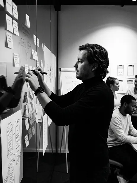
My focus was the interface: what goes where, how people interact with it, and which features earn a place. Rather than write it all down first, I got to a clickable prototype quickly, so stakeholders could hold the thing in their hands and we could start testing against something real. That prototype became the way decisions got made. Out of those rounds came the feature set the team then started building.
[05]
What I would do differently
Looking back, we sometimes polished before we tested. At one point we spent three or four days on what a single smile, one point in the system, should look like. Today I would make several directions in an afternoon, put them in front of people and throw away what does not work, before anything gets locked in. The craft is the same. The order changed.
Learn first. Perfect later.
[06]
Foundations
I have no numbers to show for it, and I cannot say which pixel of ours shipped one to one. What I can say is that we laid the foundations, together with the team at Q8, for the app that is out there today. Open Q8 Smiles now and the broad strokes are the ones we decided on in those first phases. It was early in my career, and helping set the base of a platform at that scale is still something I am proud of.
Made with the Prophets team
This project came to life during my time at Prophets (now IO) and is made in collaboration with the super talented people over there.

Building something people should use every day?
Habits are designed, not hoped for. Let's talk about making your product part of the routine.
[Next project]
DCM